One Flow. 60% Faster. The Promo Was There. The Checkout Wasn’t Ready for It.
Done before you sit down. We got it to 2. Because a commuter shouldn't have to think—they had 3 minutes and 5 taps standing between them and their coffee.
Industry
B2C
eCommerce
Mobile
Role
Lead Product Designer
Team
2 Designers • 1 Researcher • 1 PM • 2 Developers
Skills
UX Design • Prototyping • Scalable Design Systems • Rapid Iterations • Stakeholder/User Interviews • Moderated Usability Testing • A/B Testing • Data Analysis • Accessibility (WCAG)
Impacts
01 · The Challenge: The 3-Minute Window
A revenue problem. A frustrated commuter. The same root cause.
Tim Hortons’ loyalty program drove 50% of transactions. With 5M+ monthly app users, digital guests spent $354/year vs. $81 for non-digital—4x higher. Every friction point costs measurable revenue.
The user: a commuter ordering at 8:14 am, standing on a platform, phone in one hand, bag in the other. Speed wasn’t just a feature; it was what the user valued most. This highlights the importance of simplicity and quick access, fostering empathy for user priorities.

Business goal
Increase promo adoption to drive repeat orders and higher transaction values. Convert promotional spend into revenue.
User need
Order—including any available promo—before the ride arrives. No detours. No backtracking. No thinking.
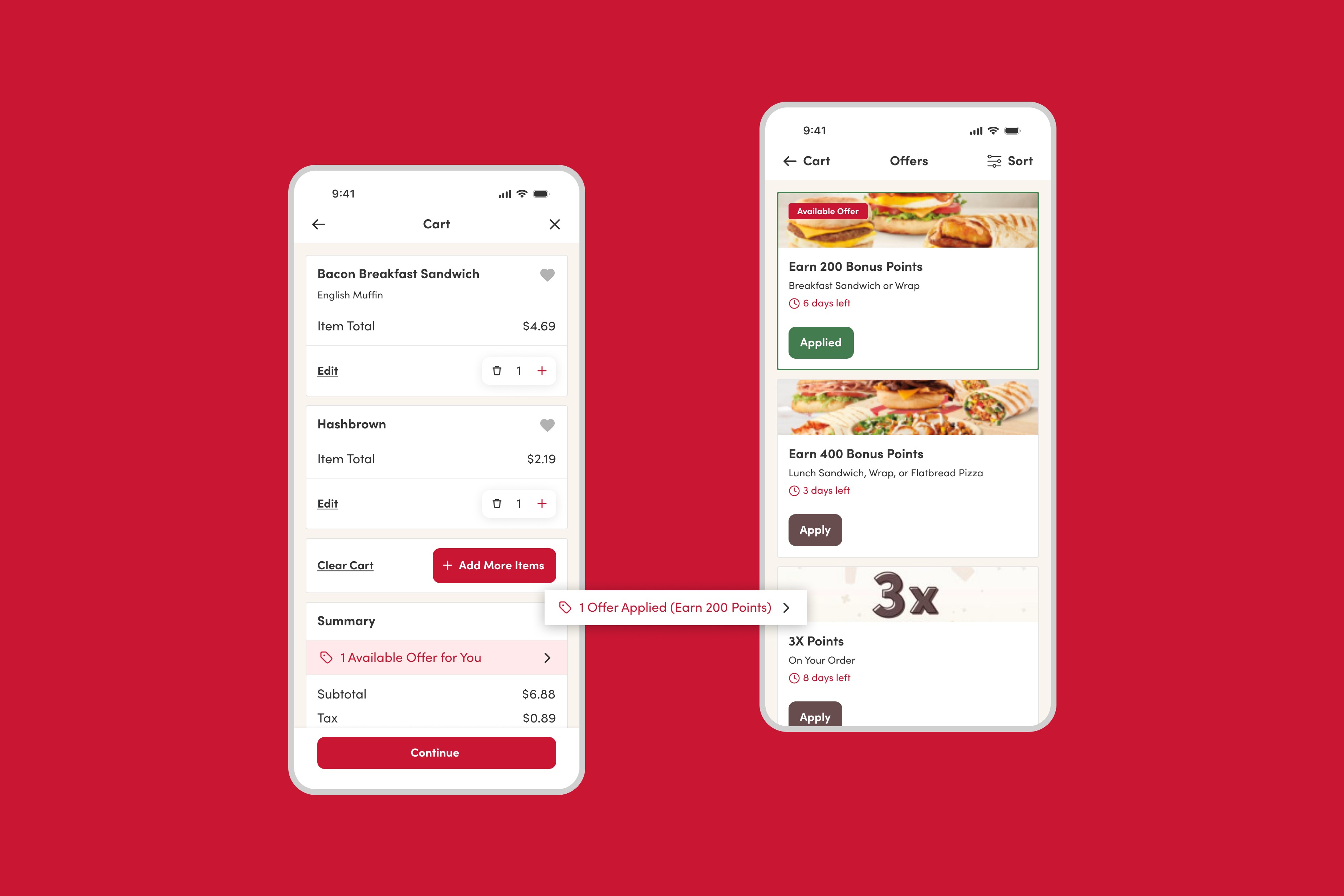
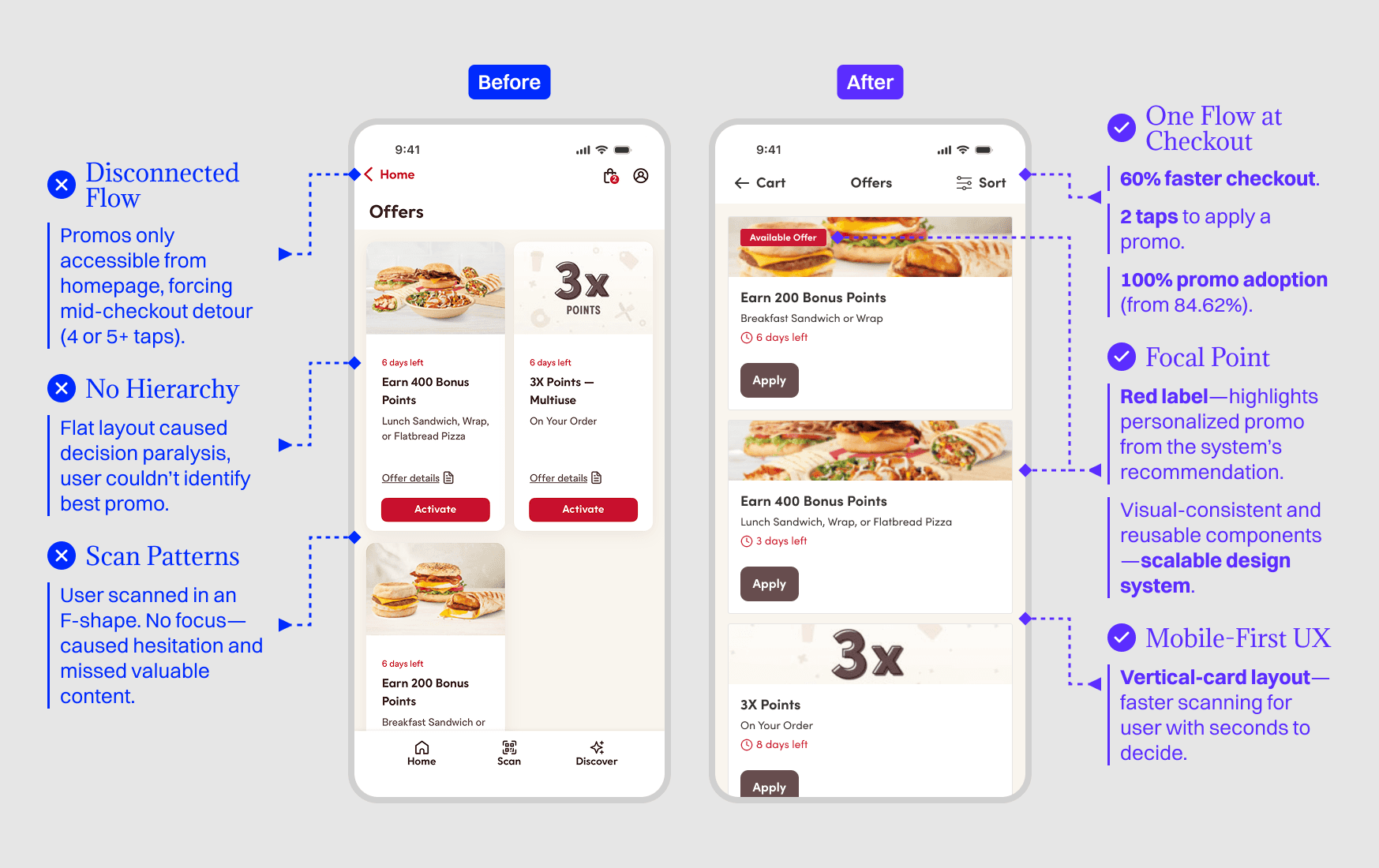
02 · Two Pages. Zero Connection.
The promo was there. The moment wasn’t.
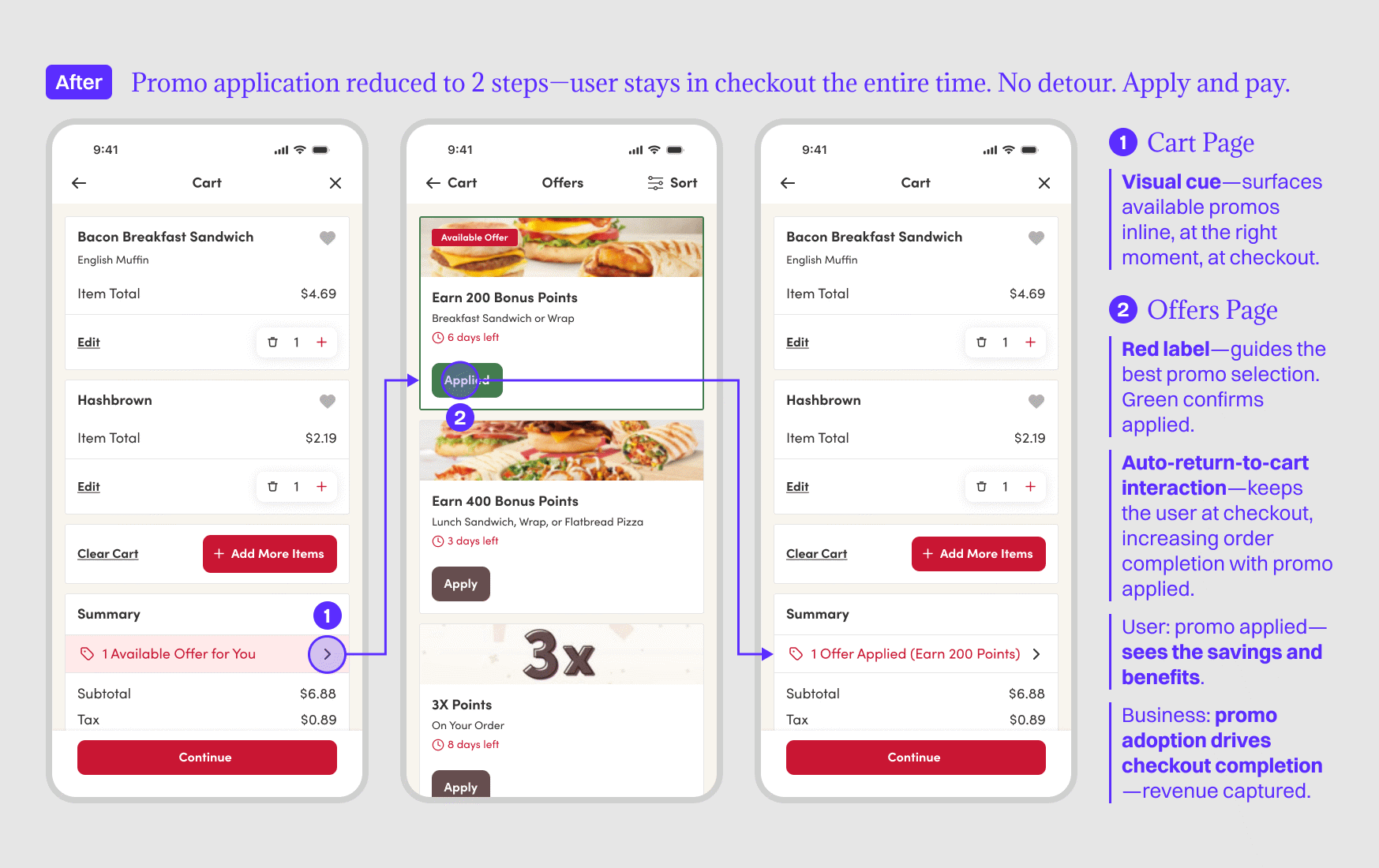
Promos lived on the homepage. Checkout lived on the cart page. They’d never been connected. To apply a promo, the user had to leave the cart, navigate back, find the promo, apply it, and return to the cart. With 4 or 5+ taps required. While their ride was arriving.
“I just gave up. It wasn’t worth missing my train.”—Participant.
“I didn’t think about discounts until after I’d paid. By then, it felt too late.”—Participant.
03 · The Approach: Research Methods & Findings
Done before you sit down. Here’s what we measure to drive the next iteration.
Methods
What it revealed
5-Second Test
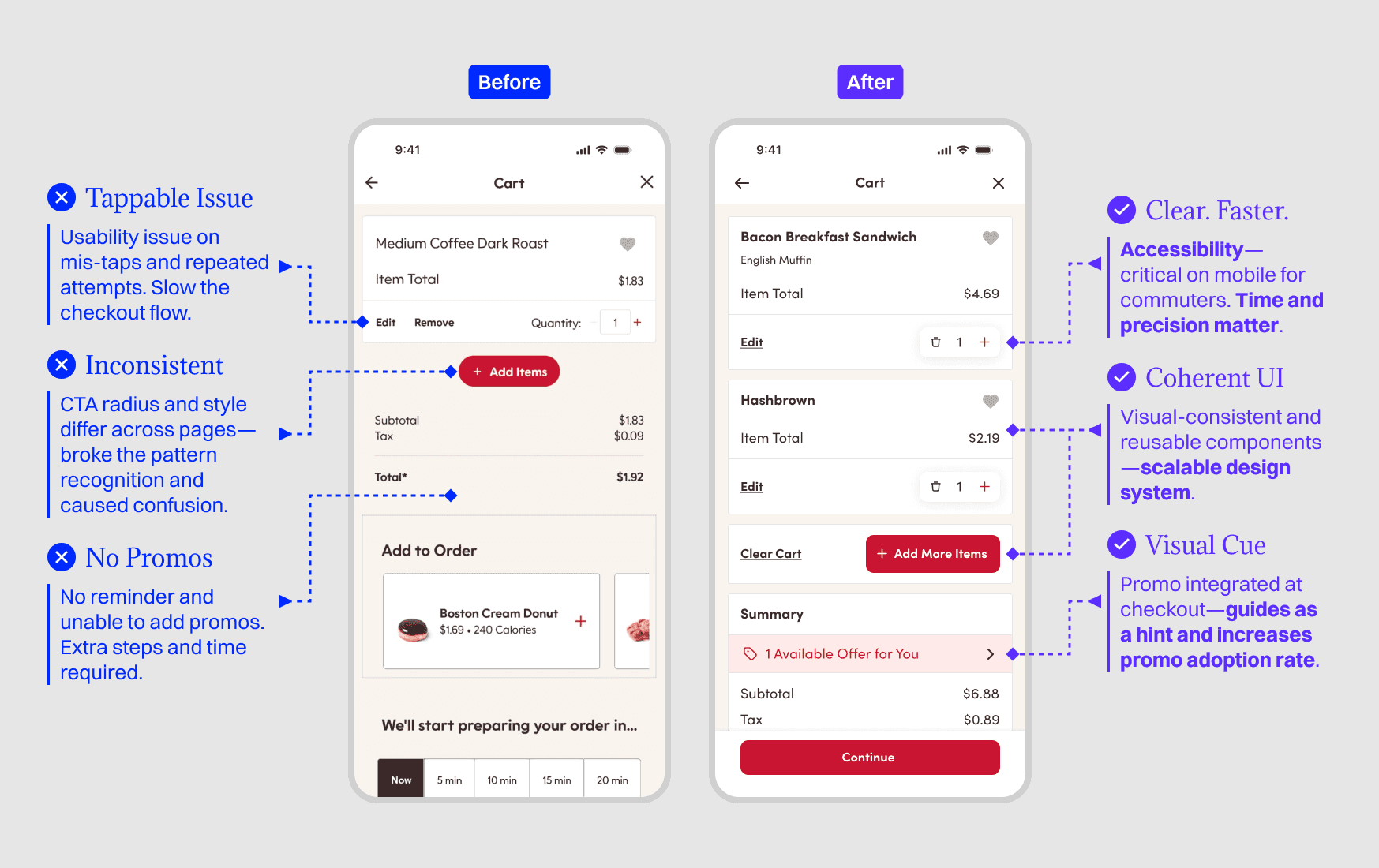
No focal point across all pages. The user couldn’t identify CTAs on the homepage—the same flat layout caused decision paralysis on cart and offers pages.
Unscripted Observation
Commuter tunnel vision—promos only accessible from the homepage were invisible cognitively (not part of the checkout mental model) and visually (absent from the cart page).
Think-Aloud
Emotional frustration surfaced at cart—wrong moment, wrong place across pages.
Moderated Usability Tests (x2)
Without: 8-sec pause, 2 abandoned (15.38%). With auto-return: 84.62%→100% completion rate—zero promo abandonment.
A/B Testing
Red label, vertical-card layout, auto-return—validated for faster user decision-making—reducing promo application from 5 taps to 2.
Follow-up Interviews
Confirmed: user wanted promos—the flow (before) never gave them the chance.
What delivered
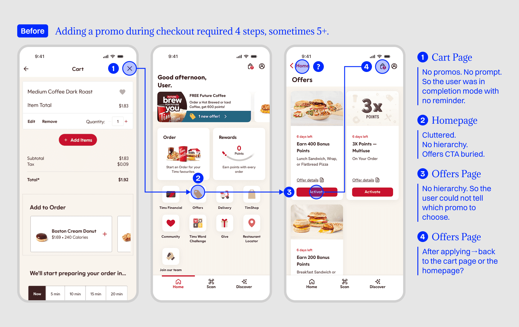
Promo application: 5 → 2 taps.
Checkout time: ~60% reduction.
Promo adoption rate: 15.38% increase.
Auto-return-to-cart interaction.
Scalable design system and consistency.
04 · The Outcome: Design Decisions
Why→Outcome
Problem→Solution: Every decision justified by user need and business goal.
One Flow. Finally. Promo application reduced to 2 steps—user stays in checkout. No detour. Apply and pay.
Impacts